Packaging & Branding: Just Coco
I wanted to take a step back to what inspired my career in packaging and branding by referring to this project from university, a brand and packaging project called Just Coco.
With a Fine Art background and a realisation that this is one of the toughest industries to thrive from I decided to study Graphic Design at university in the hopes that it would bring the same creative satisfaction but with an added monetary value. Though to some extent enjoyable this wasn’t a subject that I could relate to, not until my final year and an opportunity to create my own brief. With openness in mind and a part time tutor from a brand background I was able to create a tailored brief, and a creative niche for that matter that would fully take my interest – a catapult for my passion of brand and packaging.
Brief: This project was created for a third year university brief. I decided to create a brief that involved branding a chocolate company from start to finish, from the logo, packaging and website to the details of the delivery car, all in an eco friendly and sustainable manner.
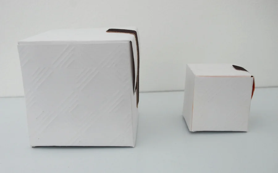
Outcome: The design is inspired by two very different areas: Aztec art and Ghanaian patterns, both chocolate origins. The packaging is fully recyclable and designed in a flat pack way as to never create excess waste and would be printed by hand with soya inks. The side of the box will be machine embossed with the Ghanaian patters.
The logo is printed on sealing tags which will seal the box once it has been assembled and filled with chocolate.
The leaflets are designed with empty space inside so ingredient and detail stickers can be placed inside as the customer selects the chocolates from the display, meaning no mass leaflets have to be produced and the customer gets the ingredients listings for their chosen product only.