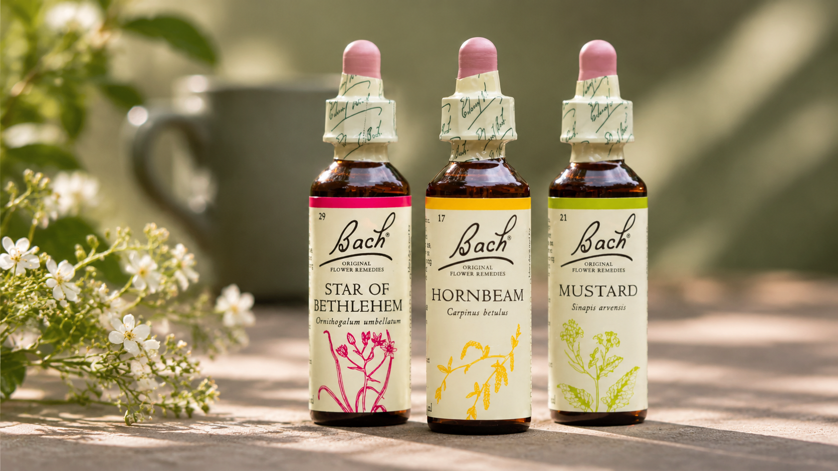
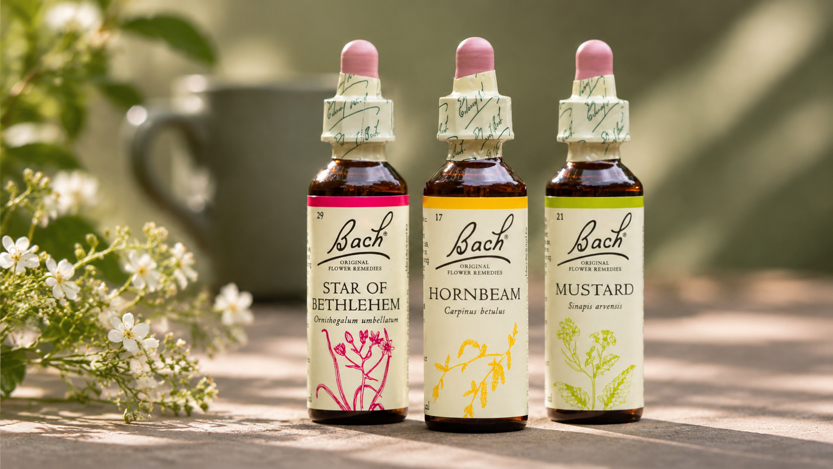
Bach | Final rebrand
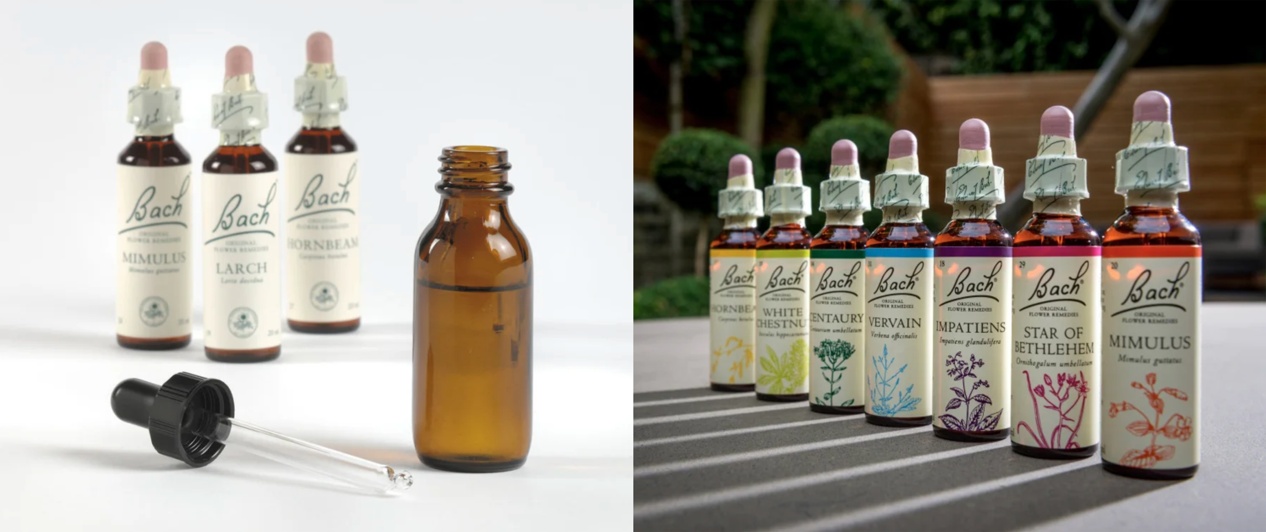
Bach | Before & After
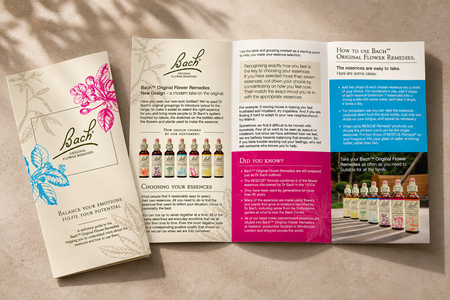
Bach | Brochure
Brief: With a heritage spanning decades and a portfolio of 38 individual flower remedies, Bach faced increasing competition within the homeopathic category, making it harder to stand out on shelf. The challenge was to revitalise the brand's packaging, introducing greater visibility and a more contemporary appeal while preserving its trusted heritage. Equally important was creating a clearer, more intuitive navigation system across seven emotional need-states, helping consumers identify the remedies most relevant to them.
Solution: A considered evolution of the brand's visual identity, balancing heritage with a fresh, contemporary aesthetic. By introducing a distinctive colour-coding system across the seven need-states, complemented by delicate botanical illustrations, the packaging creates a more intuitive shopping experience while bringing greater personality and vibrancy to the range.
The iconic Bach signature, traditional typography and familiar cream backdrop were retained to preserve brand recognition and authenticity. The result is a cohesive packaging system that celebrates the brand's botanical roots, strengthens shelf presence and makes a complex portfolio of 38 remedies easier to navigate.