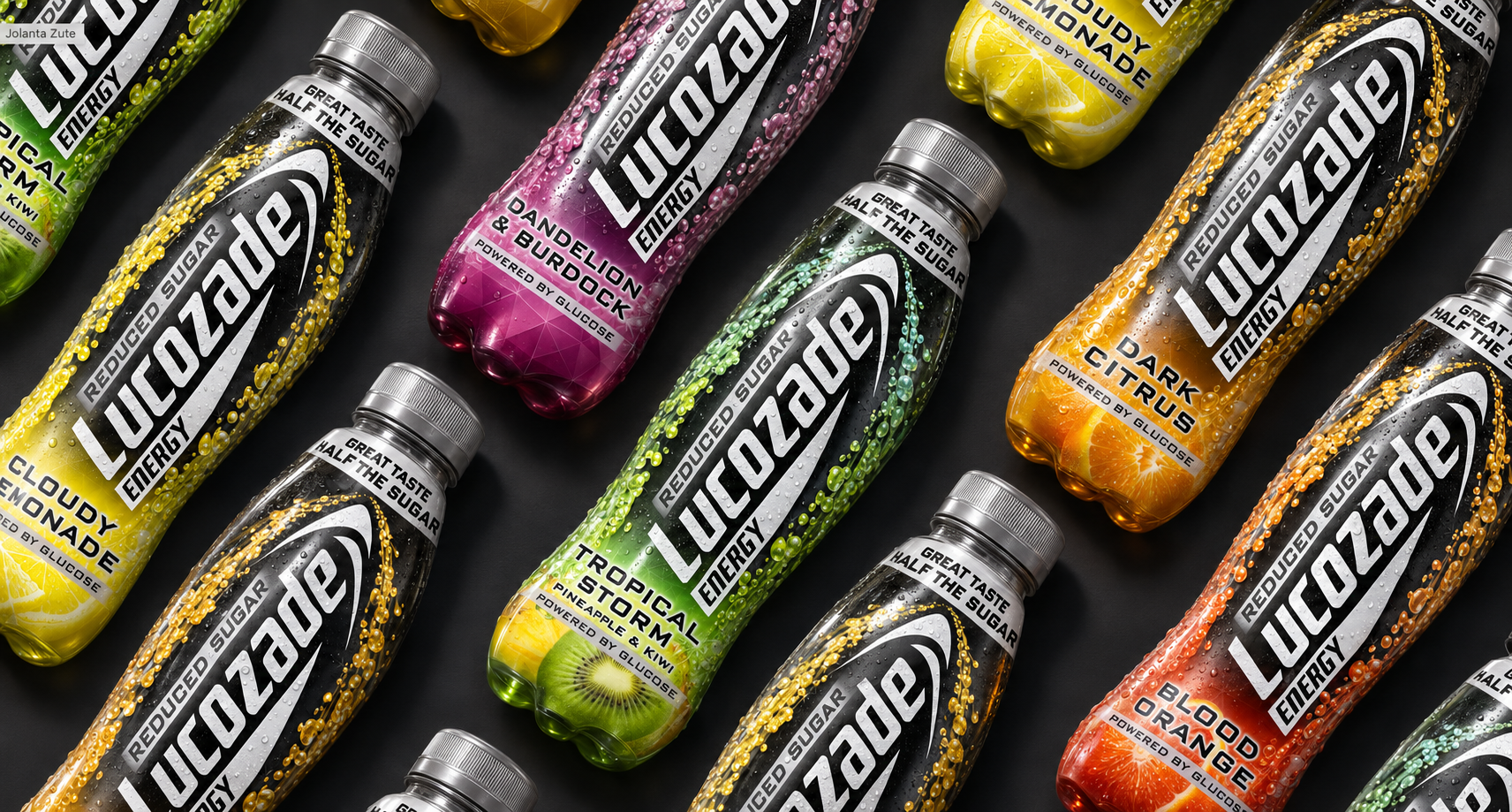
LUCOZADE | Final design - all flavours
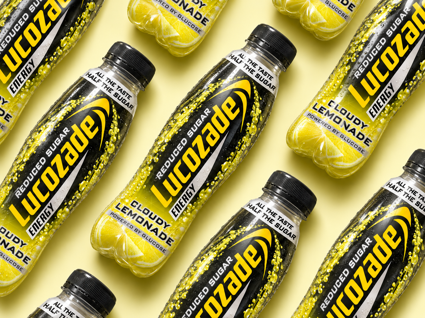
LUCOZADE | Final design
Brief: To develop a distinctive visual identity and packaging direction for Lucozade Reduced Sugar, targeting a younger, calorie-conscious male audience who wanted to make more mindful choices without compromising on the taste, energy or brands they know and love. The challenge was to establish a bold new proposition within the Lucozade portfolio while retaining the brand's strong heritage and recognisability.
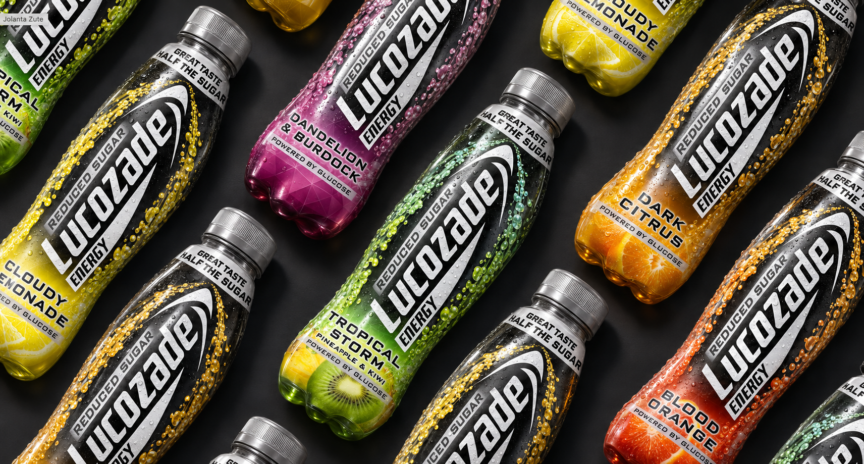
Solution: A bold, high-impact packaging identity that balances a more masculine aesthetic with the vibrant energy and flavour cues synonymous with Lucozade. A predominantly black colour palette creates a strong, contemporary presence, while vivid, flavour-specific colours and fruit imagery inject energy, appetite appeal and clear product differentiation across the range.
The iconic Lucozade logo remains central to the design, preserving brand equity, while prominent reduced-sugar messaging communicates the product's key benefit. The result is a cohesive, recognisable range that gives a more health-conscious audience a compelling alternative without sacrificing the personality and familiarity of the original brand.
Involvement: Packaging design