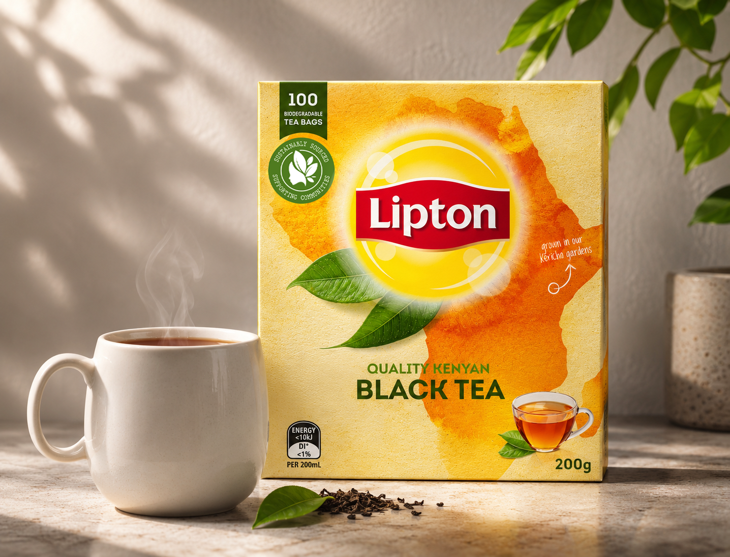
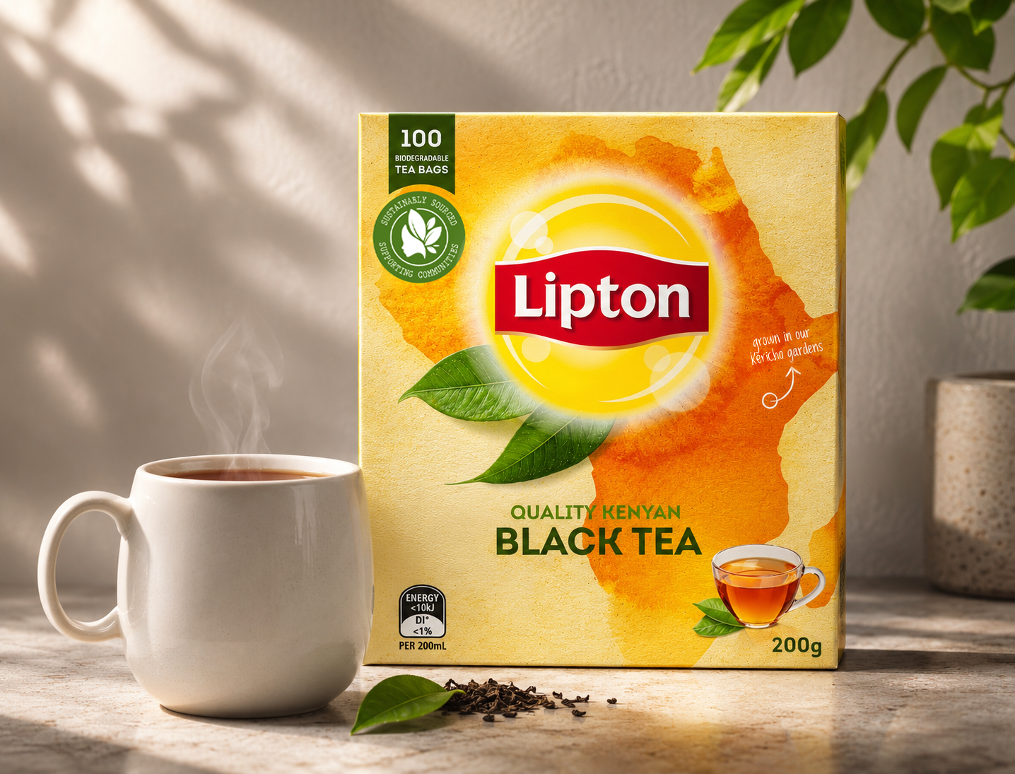
LIPTON | Final design
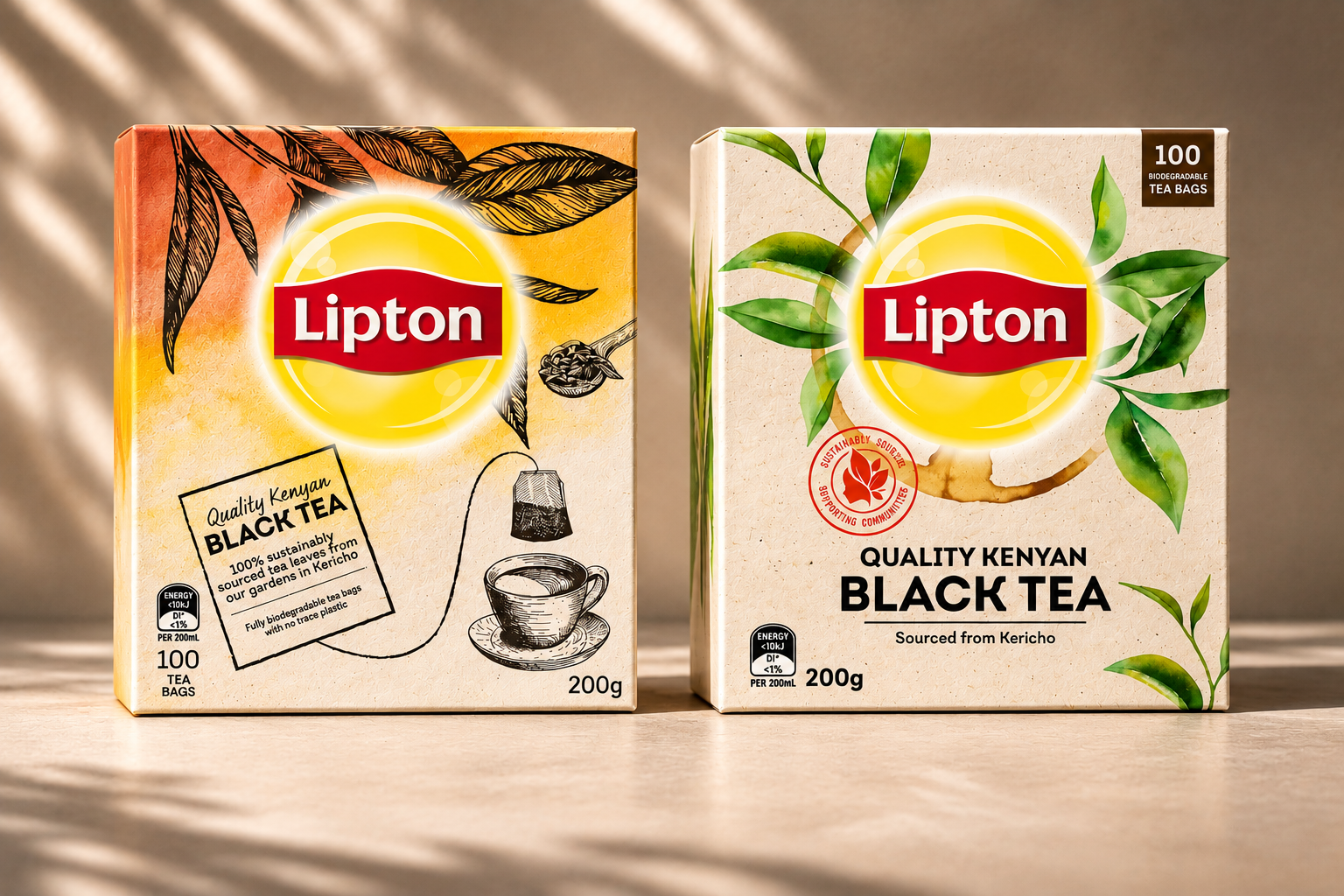
LIPTON | Concepts
Brief: As one of the world's most recognisable tea brands, Lipton has long maintained a consistent and familiar visual identity. The challenge was to reimagine the packaging for its classic Black Tea range, introducing a fresh, distinctive creative direction while retaining the brand's established heritage and recognition. With complete creative freedom, the opportunity was to explore something bolder and more meaningful.
Solution: Drawing inspiration from the origins of tea, I developed a concept that places provenance and storytelling at the heart of the packaging. The design celebrates Lipton's Kenyan tea-growing heritage, using the silhouette of Kenya as a striking visual element, complemented by organic textures, botanical imagery and subtle references to the tea's origins.
By retaining Lipton's iconic red and yellow palette and recognisable brand identity, the concept balances familiarity with a more contemporary, expressive aesthetic. The result is a distinctive packaging direction that celebrates the journey from tea garden to cup, while reinforcing Lipton's long-standing presence in the market.
Involvement: Packaging design