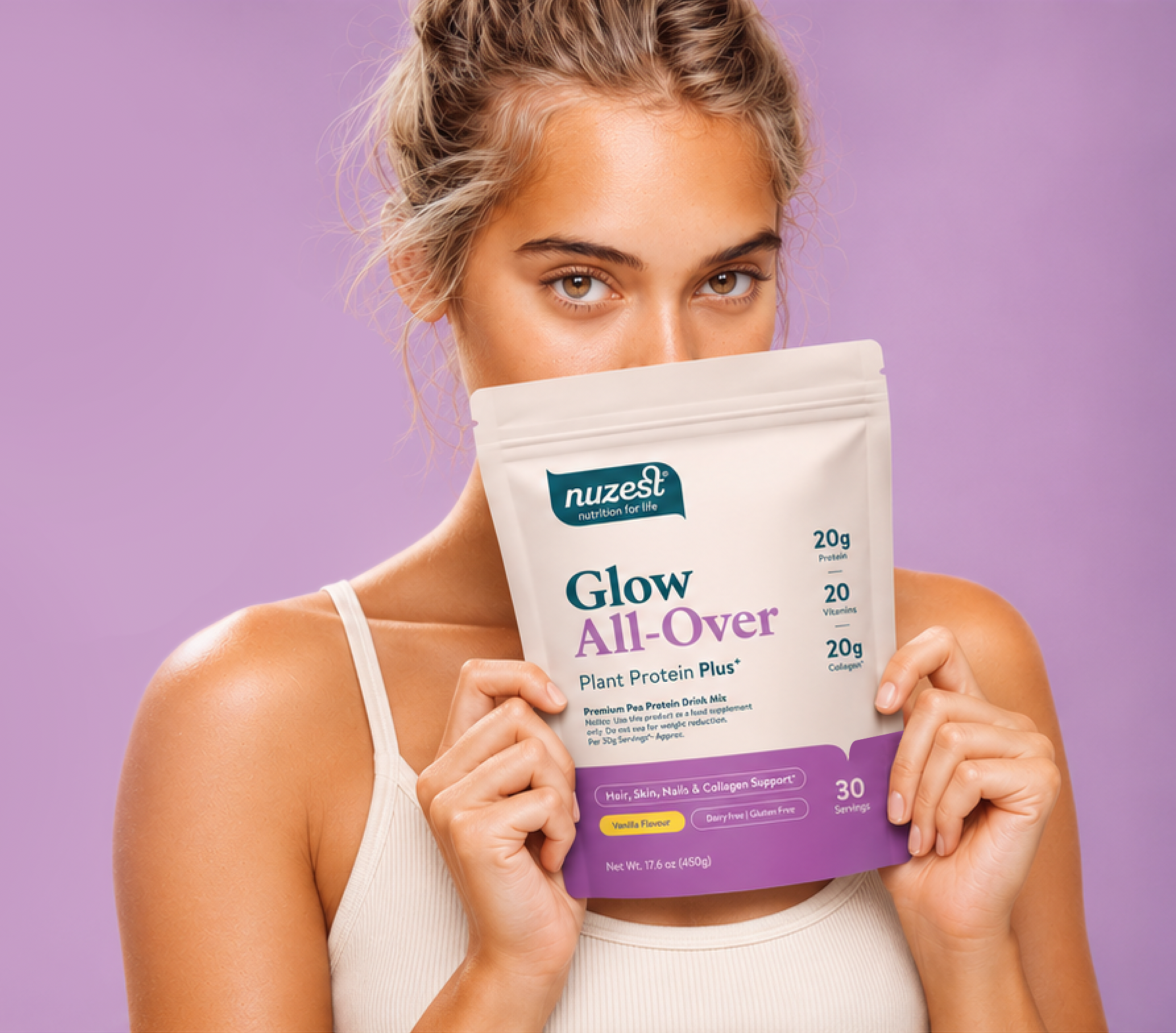
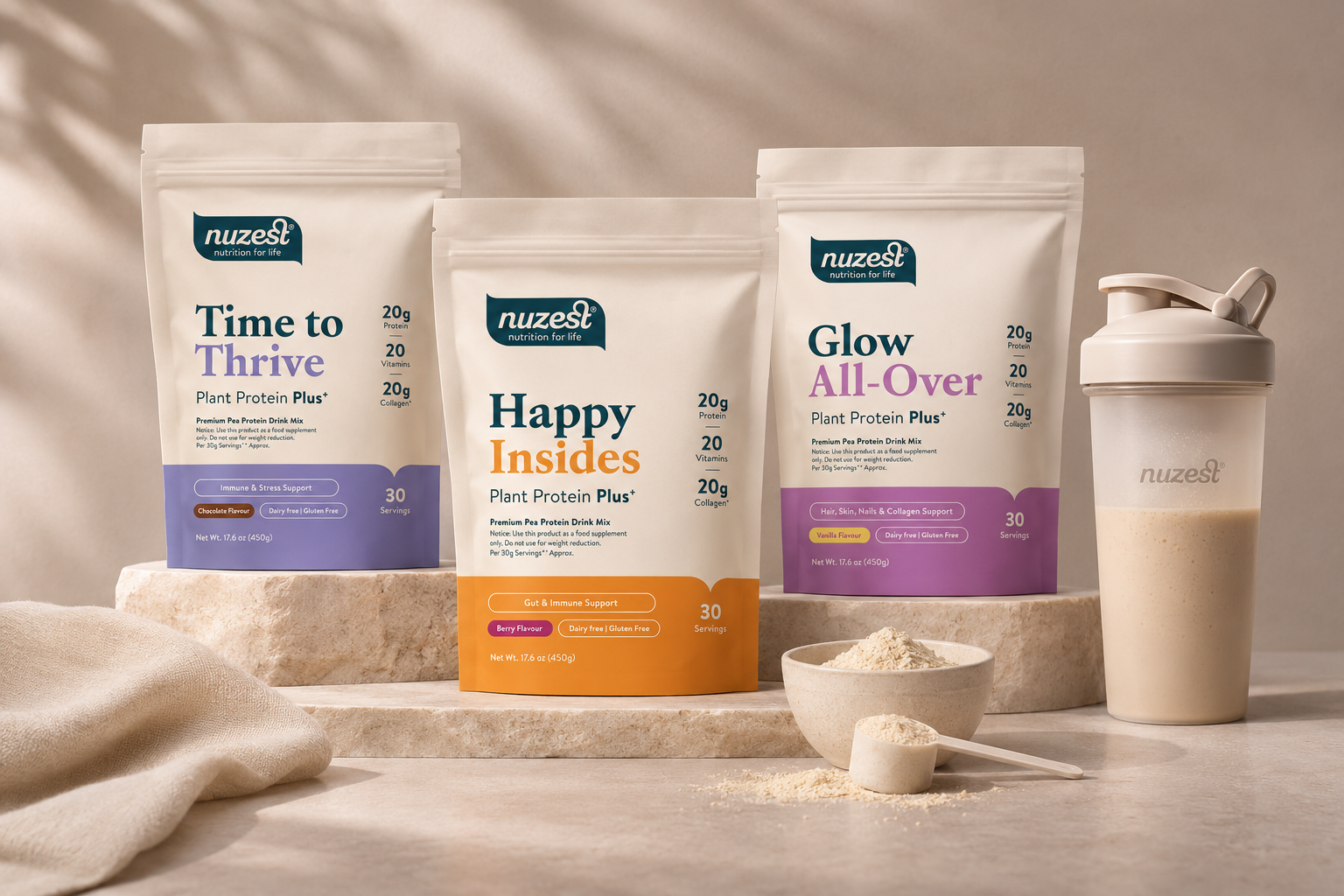
Nuzest | Packaging design
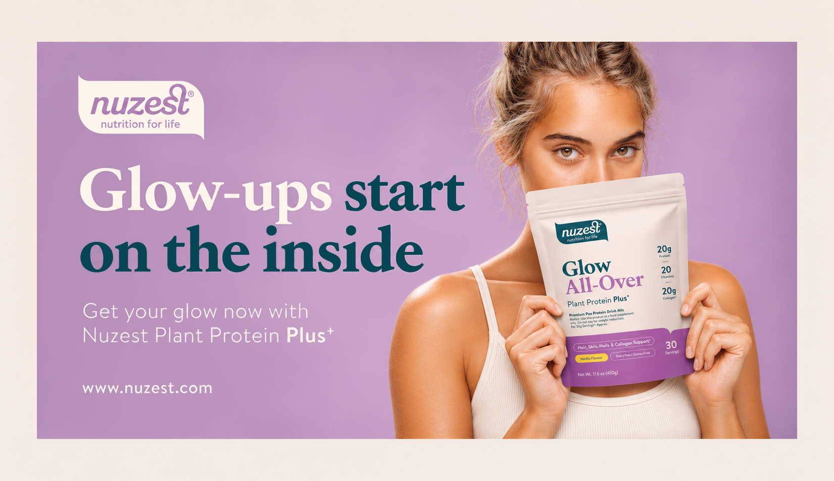
Nuzest | Key Visual
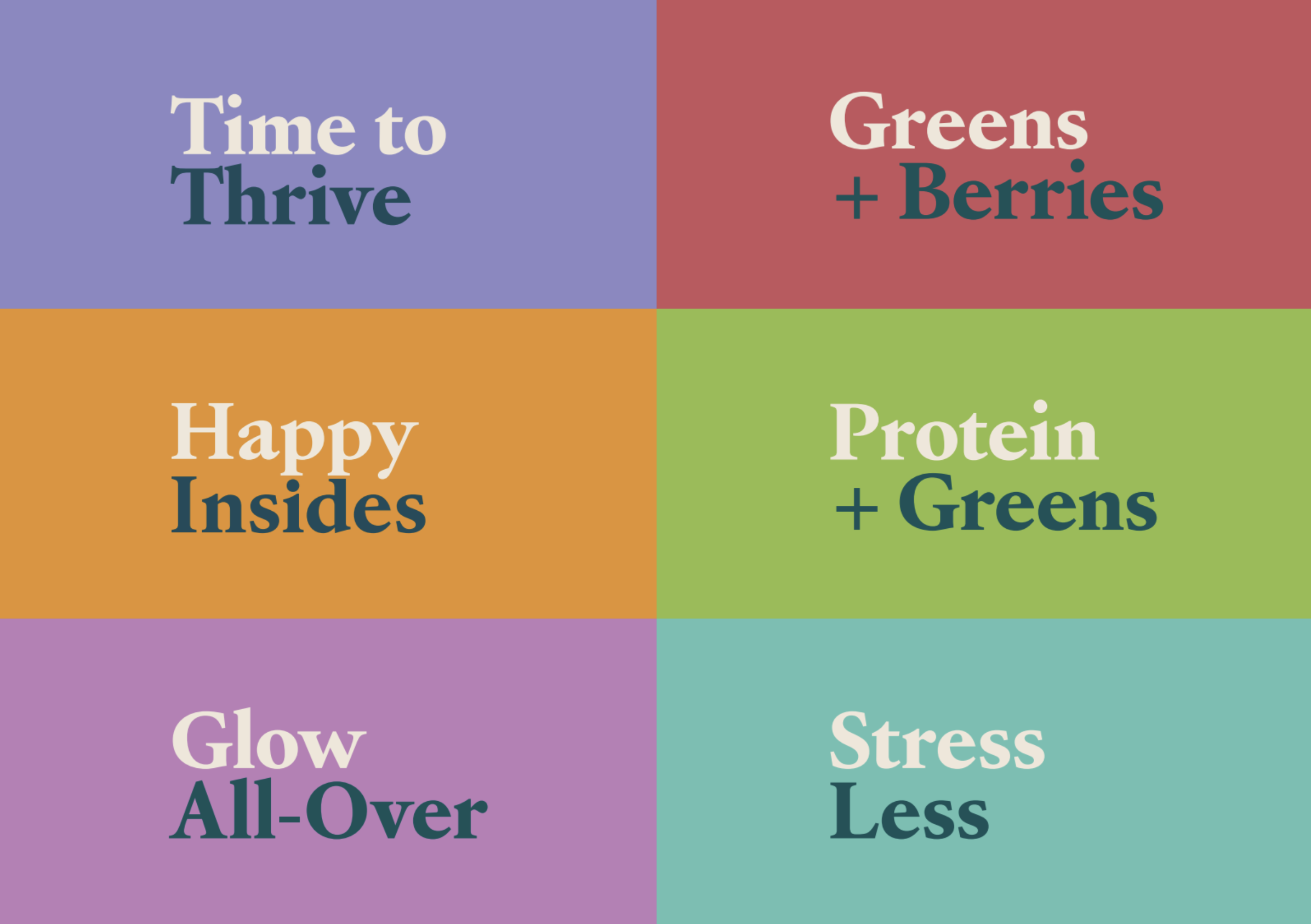
Nuzest | Segmentation
Brief: To expand Nuzest's offering beyond traditional protein supplements and into the growing functional wellness category, with a new range developed predominantly for the US market. Targeting a female audience seeking more from their everyday nutrition, the challenge was to create a distinctive product range that combined the benefits of plant-based protein with additional wellness propositions, including gut health, beauty, immunity and stress support.
The range needed to feel fresh, approachable and relevant to a lifestyle-driven consumer, while remaining recognisably Nuzest.
Solution: A vibrant, benefit-led identity that brings personality and simplicity to functional nutrition. Moving away from conventional sports nutrition cues, I developed a softer, more playful visual language through expressive typography, uplifting product names and a distinctive colour palette.
Each product was given its own personality and colour identity, creating clear differentiation across the range while maintaining a cohesive packaging architecture. The design system extended seamlessly into digital campaigns and marketing communications, positioning Nuzest as an accessible, lifestyle-focused wellness brand that offers more than protein.